Intelligent pump station control is a tricky proposition. Engineers design a pump
station and (at least tacitly) outline a control narrative for a site. A contractor
builds the station as close as possible to the specification then a system
integrator weaves in a control loop on top. Finally, months or years after the
design, the keys to the finished station are given to the operators. Even for a
perfectly designed and implemented project, the operators are usually not given a
detailed playbook on how to run the station. It’s a long communications channel and
rarely does the information make it intact from one end to the other. All too often,
someone is left struggling at the end, fiddling with settings until it seems like
the pump station is working and nothing’s going to blow up.
Even well-informed operators can’t react ideally to every situation. Perhaps in six
months the system changes unexpectedly and the old control scheme doesn’t work well
anymore. Maybe the station is designed for peak day and doesn’t function well on low
flow days. The station could even get totally re-purposed. Whenever someone notices
the station is out of whack, settings are adjusted using the trial and error method
until it seems to work again. The water will keep flowing, but chances are it won’t
be very energy efficient and it can harm the pumps too.
Pumps are individual
At each step of this process, pumps that were merely similar were treated as identical. The engineers, contactors, integrators, and operators all ignored this because it’s hard to quantify. Each pump is different when they’re put into service (even if the make and model are the same) and even properly operated pumps undergo wear, losing capacity and efficiency over time. On top of this, there’s no magical force that makes the pumps wear uniformly at a pump station. The only way to account for the current state of the pump is to measure its performance curves using a pump test. There’s too much to discuss on this topic here, so check out this blog post for more information.Without measuring the health of each pump, it is nearly impossible to operate a pump station at peak efficiency. As system demands change, as tank levels fluctuate, and as pumps slowly wear over time, what is optimal at a station changes, too. To really optimize a pump station, a single solution is not good enough. The answer must be recomputed faster than the variables change.
Optimizing a pump station
When we say we want to optimize a pump station, what we really mean is that we want to produce a desired flow using the least amount of electrical power possible. That means minimizing the power divided by the flow. This ratio is called “specific energy” and is normally reported in kW-h/MG (at least in the US). This turns out to be a pretty high level measure of energy efficiency and supersets Wire-To-Water Efficiency. It accounts for losses from the electrical switchgear, motors, pumps, and piping.Using tested pump curves and an up-to-date system curve, a station’s operation can be very accurately modeled. This means computing the flow, operating head, and power consumed for each unique combination of speeds. The real hurdle, though, is the sheer scale of this calculation. If a pump station has five pumps on VFDs that have an available range of 40-60 Hz and each pump’s speed can be set to 0.1 Hz resolution, each pump has 201 potential operating points. That means the station has 328 billion potential operating points across all combinations of pumps. This chart shows the specific energy consumption of a pump station that has 5 pumps with VFDs. The chart shows all combinations of pump operating points by sweeping the VFD frequency of each pump from 50-60 Hz in 0.5 Hz steps. This graph is very complex yet represents only 0.001% of the possible operating points.
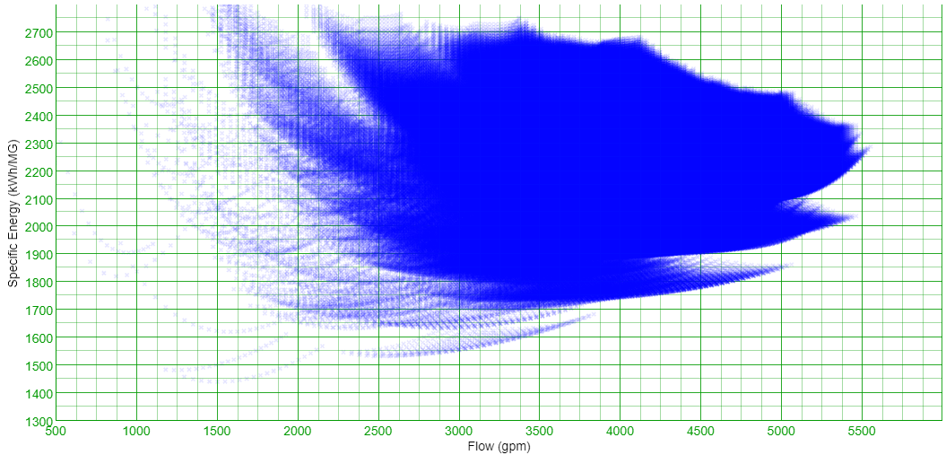
Overwhelming, right? Pumps running alone, on the far left of the Specific Energy Map, produce a simple arc. However, each configuration with more than one pump running has an area in which it can operate. The more pumps running, the denser the cloud of operating points. The next step is to winnow down the possibilities some. To do this, we find the lower bound for each regimes' cloud of possible operating points.

Each green dot represents the most efficient way for a set of pumps to produce a
certain flow. Each red dot also represents an optimum, but at least one pump is
running outside of its Preferred Operating Range (POR) at these points. For more
information on the POR, see this blog post on pump
curves. These red points are considered invalid and are thrown out of the overall
solution since operating outside POR accelerates pump wear. There are 31 curves in
the above graph. That is because there are 32 combinations of pumps to run when a
station has five pumps. One of these configurations is all pumps off and isn’t shown
on the graph.
After the most efficient way to run each set of pumps has been identified,
algorithms are used to identify the overall convex hull for the pump station, which
defines the most efficient way to operate the station for any desired flow. This
completes our Specific Energy Map:
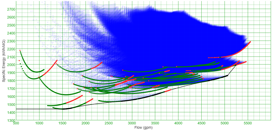
This map shows the convex hull as a black line. Note that the convex hull is
interpolated between points at certain flows. For instance, if you were trying to
operate the pump station as efficiently as possible, you wouldn’t want to operate at
exactly 4000 gpm. The most efficient way to produce 4000 gpm is at a specific energy
consumption of 1750 kW-h/MG. Assuming the station has operational flexibility (i.e.,
there’s a distribution tank that pressurizes the system), it is more efficient to
operate at 3625 gpm (1640 kW-h/MG) for a while and 4625 gpm (1790 kW-h/MG) for a
while. This results in an aggregate specific energy consumption of 1700 kWh-MG.
While a single map is useful, it is merely a snapshot of the system. As system
conditions fluctuate, this map will become outdated and wrong. The Specific Energy
Map must recomputed every few minutes (if not faster). Not only will the curves
translate up and down the specific energy axis as system demands and tank levels
change, the curves will shift relative to each other because of head differences
between each 'identical' pump. At a slower rate, the pumps will wear and their
curves will move up and to the left of the graph. As an example, let’s look at
several days at a real pump station with three ‘identical’ pumps to see how a
Specific Energy Map can change in a relatively short period of time:
